LOGO VARIATIONS - WHAT THEY ARE AND WHY YOU NEED THEM

A new brand identity consists of so much more than a logo. In all of my branding packages, I include a Primary logo, a Secondary logo, submark and graphics (as well as a mood board, colour palette and font selection). You've probably heard these terms used around the subject of branding, but might not be sure exactly what they mean. Here's a summary of what each of these terms mean, why you need them, and how to use them in your business.

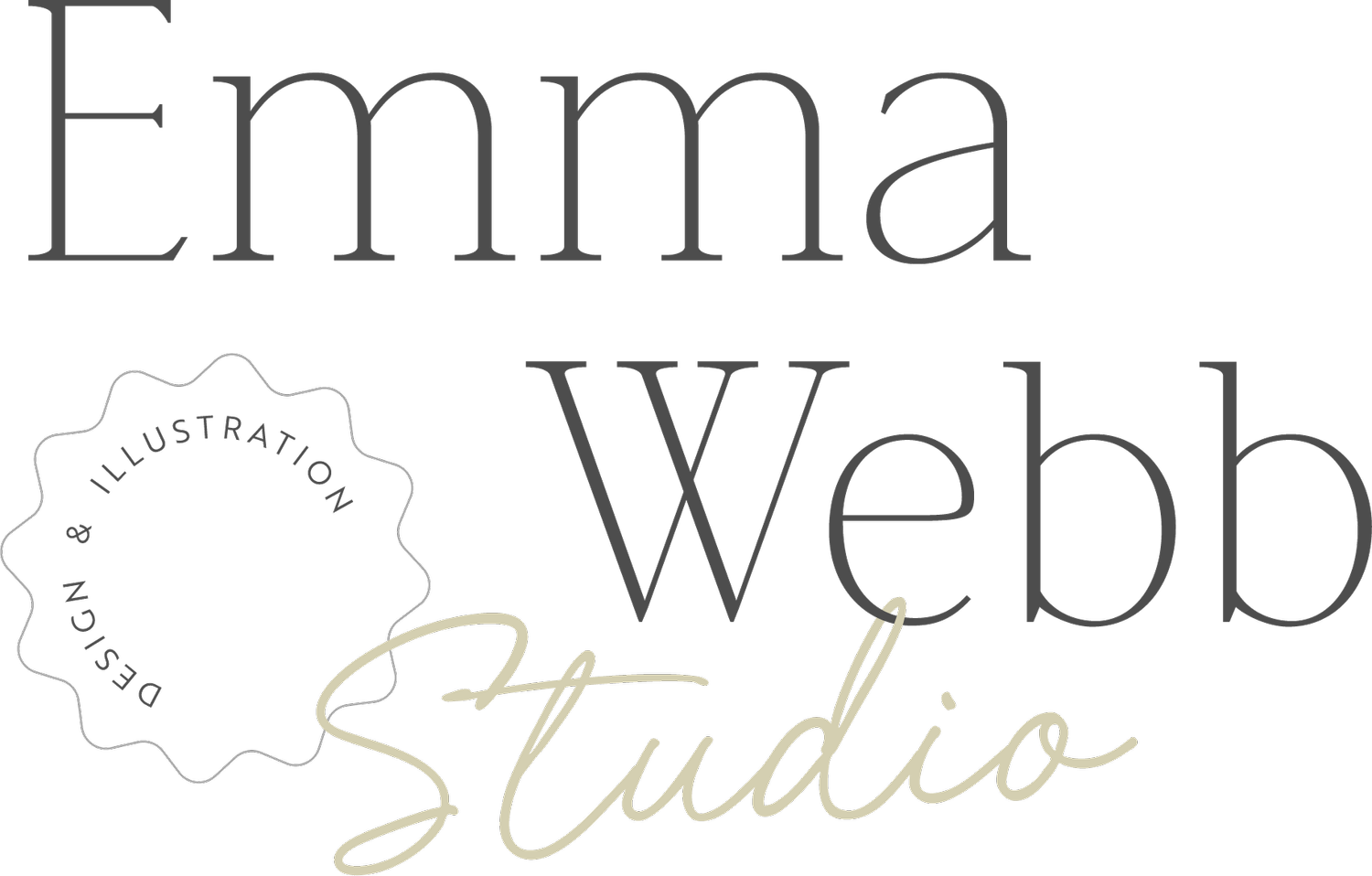
Primary logo
This is your main logo, the one that the rest of your branding is based on. Your primary logo will usually include your full business name, a tagline if you have one, and potentially an illustration or symbol (although some logo styles are text only, which can also be very effective)

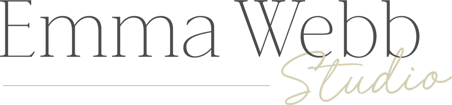
Secondary / Alternative logo
A secondary or alternative logo is usually a simplified version of your logo, or it may use the same elements rearranged in to a different composition. The tagline is often removed, stripping the logo back to its most essential elements. The idea is to provide you with the flexibility to use your logo in various design settings, so if your primary logo is a wider layout, your secondary logo should be more square, and vice versa.

Submark
Submarks are the most condensed version of your logo. They're usually made up of just a few key elements from your primary logo, and use minimal colours. This could be the initials of your business name, or the main symbol or illustration from your primary logo. Submarks are often in a circular or square format, making them perfect for your social media profile images, stickers and watermarks on your photos (especially for photographers).

Graphics
Graphics (and / or patterns) are designed to compliment your logos. If there are any illustrated elements in your logo, these may be developed in to a stand-alone graphics, or turned in to a repeat pattern. Graphics can also be designed to compliment a text-based logo, adding more interest and colour to your brand. These are my favourite part of a brand to create, they really help bring a brand together and complete the whole look.
Why do you need all these variations?
Having multiple versions of your logo, and complimenting patterns and graphics along side it, allows you to stay consistent across all areas of your business without repeating the exact same logo across the board. You should have a suitable logo or graphic to use everywhere form your website and business cards, to your Instagram profile and thank-you notes. This will give your business a far more professional feel compared to having one solo logo design.
I always provide my branding clients with at least one logo variation in each of these categories, along with a brand style guide that explains how and where to use each one. If you're looking for a rebrand for your business, an identity for a business you're planning to launch, I'd love to chat to you about your ideas and explain any of these terms further if you need!